Style & Context
Influences
Renaissance portraiture, film noir lighting, 1980s soft-focus glamour photography
Location
This cover arrived when metal gods were expected to show cracks in their armor rather than invincibility.
Visual Language
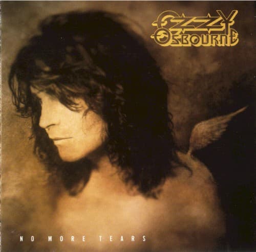
The soft-focus portrait technique humanizes metal's most theatrical figure through studied vulnerability and classical composition.
Symbols
Downcast eyes
Ozzy's averted gaze signals emotional exhaustion and introspection after years of excess and loss.
Bare shoulders
The exposed skin strips away theatrical personas, revealing the human beneath the Prince of Darkness.
Winged shadow
The demon silhouette behind him represents darkness as an inescapable companion rather than costume.
Where Sound Meets Image
The cover's duality perfectly mirrors the album's sonic range, from the doom-laden title track's crushing riffs to the piano-driven vulnerability of 'Mama, I'm Coming Home.' Ozzy's exposed presentation reflects lyrics confronting mortality, addiction, and relationship damage across tracks like 'Time After Time' and 'Road to Nowhere.' The shadowy wings reference the album's darker material, including 'Hellraiser' and 'Desire,' while the weary human face connects to the record's surprising emotional depth. This visual vulnerability made the commercial hard rock more palatable without compromising the doom-influenced heaviness that gave the album weight.
This cover helped normalize emotional exposure in metal imagery during the genre's transition into the 1990s. Its willingness to show weariness rather than invincibility influenced how aging metal artists could present themselves without losing credibility. The photograph's intimacy contrasted sharply with the fantasy barbarian and horror imagery dominating 1980s metal, suggesting veterans could age visibly rather than maintain impossible personas. While less visually aggressive than classic Ozzy covers, its honesty resonated with fans watching their heroes confront middle age, addiction recovery, and changing musical landscapes.