Style & Context
Influences
German expressionist cinema, body horror, medical photography, Neue Sachlichkeit
Location
Rammstein emerged from former East Germany, using industrial aesthetics to process authoritarian trauma and reclaim German language.
Visual Language
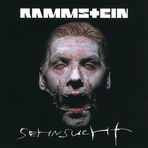
The clinical photographic approach recalls Weimar-era portraiture while the restraint device bridges art photography and shock imagery.
Symbols
metal mouth apparatus
The restraint device represents forced silence and the suppression of German voices throughout history.
direct eye contact
The unflinching gaze challenges viewers to confront discomfort rather than look away from provocation.
slicked-back hair
The severe styling evokes both 1920s German expressionism and authoritarian aesthetics the band critiques.
Where Sound Meets Image
The mechanical restraint device perfectly visualizes Rammstein's industrial percussion and machine-like precision—human emotion constrained within rigid rhythmic structures. The muted suffering in the eyes reflects songs exploring repressed desire, particularly the title track's theme of longing trapped beneath control. The stark black-and-white aesthetic mirrors the album's minimal electronic elements and martial drum patterns, while the confrontational presentation matches lyrics deliberately courting controversy through ambiguous provocation.
This cover established Rammstein's visual identity of clinical provocation that influenced two decades of industrial metal aesthetics. The restrained-face motif became shorthand for the band's approach to taboo subjects, spawned countless imitations in extreme metal photography, and demonstrated how medical-industrial imagery could convey psychological themes without traditional horror tropes. The design proved that minimalist shock could outperform elaborate artwork in creating lasting cultural impact.