Style & Context
Influences
Frank Frazetta, Roger Dean, Hieronymus Bosch, medieval tapestries
Location
This cover announced that metal would embrace fantasy literature and mythology as core identity.
Visual Language
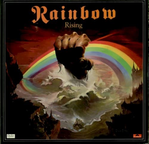
The muscular realism of the hand contrasts with the surreal rainbow-gripping concept perfectly.
Symbols
Clenched fist emerging from water
Raw power rising from primordial depths, reflecting the band's ascension from Deep Purple's ashes.
Rainbow grasped as weapon
The band literally weaponizes light itself, transforming hope's symbol into an instrument of domination.
Turbulent ocean surface
The chaos of the music industry and creative upheaval that birthed this lineup's chemistry.
Where Sound Meets Image
The violent beauty of the image mirrors 'Tarot Woman' and 'Stargazer'—songs where Dio spins tales of wizards and cosmic destiny over Blackmore's baroque guitar architectures. That fist could belong to the enslaved masses building the Stargazer's tower or the mystic forces Dio constantly invoked. The rainbow itself becomes a metaphor for the band's spectrum of sound, from delicate acoustic passages to crushing riffs. The stormy backdrop reflects the tension between Blackmore's disciplined neoclassicism and the raw power of Cozy Powell's drumming.
This cover established fantasy realism as metal's visual vernacular. Countless power and progressive metal bands—Blind Guardian, Rhapsody, Hammerfall—trace their aesthetic DNA directly to this image. The idea that a metal album could look like a fantasy novel cover became gospel. Even the border treatment, with its ornate framing, influenced how bands presented their art as something worthy of gallery consideration rather than disposable pop product.