Style & Context
Influences
Documentary war photography, boxing magazines, hardcore punk aesthetic, exploitation cinema
Location
Texas metal scene's working-class ethos made violence honest rather than theatrical spectacle or entertainment.
Visual Language
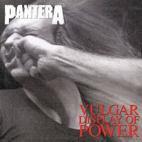
The photographic realism departed from illustrated fantasy covers, bringing metal imagery into visceral physical reality.
Symbols
The punching fist
Raw physical aggression replacing the swords and sorcery that dominated metal cover art in the 1980s.
The victim's face recoiling
The listener being hit by the sonic assault, making violence participatory rather than observational.
Close-up framing
Intimacy of violence stripped of context, making the aggression immediate and unavoidable for the viewer.
Where Sound Meets Image
The fist's impact mirrors the album's crushing guitar tone and Phil Anselmo's guttural vocal attack on tracks like 'Mouth for War' and 'Walk.' The photograph's freeze-frame violence captures the band's signature groove—the moment of impact that makes listeners want to punch walls and start mosh pits. Just as the cover offers no escape from the violence depicted, songs like 'Fucking Hostile' trap listeners in cycles of punishing riffs and breakdowns. The raw physicality of the image translates directly to the album's refusal to provide melodic relief or technical showboating.
This cover redefined acceptable metal imagery, proving that photography could be as powerful as illustration and that realism could outperform fantasy. It influenced countless post-1990s metal bands to abandon elaborate artwork for stark, confrontational photography. The image became so synonymous with aggression that it transcended album art to become a cultural signifier for barely contained rage. Modern groove and post-thrash bands still reference this aesthetic, understanding that sometimes the most effective metal imagery is the most direct and uncomfortable.