Style & Context
Influences
Orwell, Leni Riefenstahl, punk zine aesthetics, Russian Constructivism
Location
Progressive metal bands were elevating album art beyond fantasy clichés into conceptual statement pieces.
Visual Language
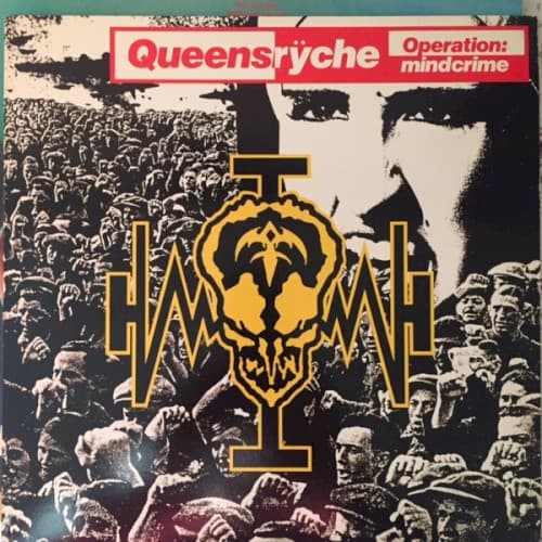
The photographic source material recalls totalitarian propaganda films recontextualized through an underground metal lens.
Symbols
Massed crowd photography
The faceless masses represent the manipulated population central to the album's political brainwashing narrative.
Central golden emblem
The ornate symbol suggests both religious iconography and authoritarian insignia, reflecting the story's corrupt power structures.
Umlaut in band name
The metal umlaut adds visual heaviness while nodding to European progressive rock influences and highbrow aspirations.
Where Sound Meets Image
The crowd imagery directly illustrates the album's narrative about Dr. X manipulating protagonist Nikki through psychological conditioning and political assassination. The fractured composition mirrors the protagonist's deteriorating mental state across the story. The gold emblem could represent the mysterious organization controlling Nikki, while the documentary-style photography reinforces the concept album's cinematic scope. The austere design matches the album's clean production and sophisticated arrangements rather than raw thrash aggression.
This cover helped establish that progressive metal could tackle serious political themes through equally serious visual presentation. The photographic realism influenced later concept albums that abandoned fantasy art for documentary aesthetics. Its success proved metal audiences would embrace sophisticated design that challenged rather than pandered, paving the way for Tool's abstract artwork and Mastodon's narrative-driven covers.