Style & Context
Influences
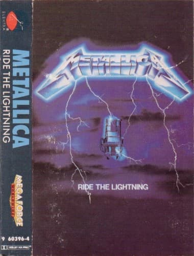
Science fiction paperbacks, B-movie horror posters, electric company warning signs
Location
The cover rejected fantasy escapism for confrontational social commentary about state-sanctioned violence.
Visual Language
Smooth gradients and glowing effects create a hyperreal nightmare that bridges comic book intensity with documentary grimness.
Symbols
Electric chair
Capital punishment becomes the ultimate metaphor for thrash metal's unrelenting sonic assault.
Lightning bolts
Raw electrical power mirrors the album's blistering speed and technical precision.
Chrome band logo
Industrial metal typography conducts energy, positioning Metallica as conduits of pure aggression.
Where Sound Meets Image
The crackling electricity mirrors the album's technical leaps beyond Kill 'Em All's raw speed—these lightning bolts suggest controlled power rather than chaos. The empty chair's isolation reflects introspective tracks like 'Fade to Black' and 'For Whom the Bell Tolls,' where Metallica explored mortality beyond simple aggression. The storm's purple darkness captures the progressive elements emerging in their thrash foundation, hinting at the compositional complexity that would fully bloom on Master of Puppets.
This cover codified thrash metal's visual rejection of genre clichés—no demons, no pentagrams, just brutal conceptual clarity. The chrome logo treatment became Metallica's permanent identity, still recognizable forty years later. Countless thrash and death metal bands adopted similar stark, concept-driven imagery rather than fantasy tableaus, making this the blueprint for extreme metal's visual seriousness.