Style & Context
Influences
war photography, dystopian science fiction, religious cemetery imagery, propaganda poster design
Location
Bay Area thrash pushed album art past fantasy clichés into stark visual statements about real-world systems of control.
Visual Language
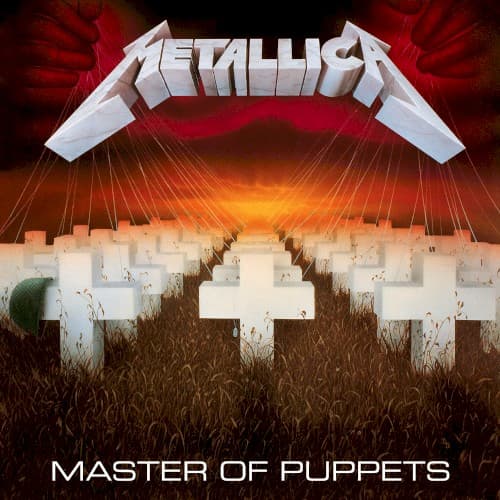
The photorealistic crosses merge with stylized sky gradients to create surreal documentary horror that feels both historical and timeless.
Symbols
white crosses
Military graves represent the ultimate endpoint of manipulation, whether by war, drugs, or obedience to authority.
puppet strings
Thin cables descending from the logo turn the entire graveyard into a marionette theater of death.
overgrown grass
Wild vegetation creeping over graves suggests nature reclaiming what ideology and addiction have destroyed.
Where Sound Meets Image
The cover directly illustrates the title track's central metaphor of puppet masters controlling disposable lives, whether through heroin, religious dogma, or military command. The crosses' military precision mirrors the album's rhythmic complexity and tight execution. The oppressive red sky matches the claustrophobic production that made this thrash's heaviest statement yet. The apocalyptic atmosphere foreshadows tracks like 'Disposable Heroes' and 'Welcome Home (Sanitarium)' while the strings visualize 'The Thing That Should Not Be' lurking above.
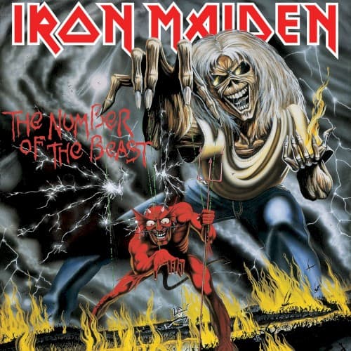
This cover established that thrash could deliver powerful visual statements without relying on Eddie-style mascots or fantasy paintings. Its influence appears in countless metal covers using stark symbolism over character illustration. The image became so recognizable that the white crosses alone signify the album in metal culture. It proved album art could function as political commentary, paving the way for thrash's increasingly socially conscious visual language through the late eighties.