Style & Context
Influences
Crime scene documentation, medical photography, punk xerox aesthetics, industrial design
Location
This cover announced Slipknot's refusal to follow Hybrid Theory's commercial blueprint into radio acceptance.
Visual Language
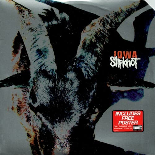
The forensic quality transforms aggression into cold documentation rather than theatrical horror.
Symbols
Canine aggression
The bared fangs represent the band's rejection of nu-metal accessibility for pure territorial violence.
Photographic degradation
The corroded, damaged quality mirrors the album's lo-fi production choices and mental deterioration themes.
Faceless animal identity
Replacing human masks with animal nature suggests the album peels back civilization to expose base instincts.
Where Sound Meets Image
The image perfectly captures Iowa's recording philosophy — nine masked performers locked in a haunted mansion, channeling genuine psychological breakdowns into the heaviest music of their career. The canine snarl mirrors Corey Taylor's throat-shredding vocal approach across tracks like Disasterpiece and People Equal Shit. The corroded, damaged visual quality reflects the album's deliberately harsh production, where blast beats and downtuned guitars create oppressive density. The absence of human features matches the dehumanizing themes of isolation, self-destruction, and Midwestern emptiness explored throughout the record.
This cover helped establish that extreme commercial success didn't require visual compromise. Its forensic brutality influenced a generation of deathcore and metalcore bands to embrace raw, unsettling imagery over fantasy escapism. The degraded photographic approach became a template for bands like Nails, Full of Hell, and Code Orange, proving disturbing realism could communicate heaviness more effectively than digital demons. The simple Iowa typography became one of metal's most recognizable logos, spawning countless bootlegs and tattoos that spread far beyond the nu-metal audience.