Style & Context
Influences
Psychedelic poster art, pharmaceutical packaging, horror movie titles
Location
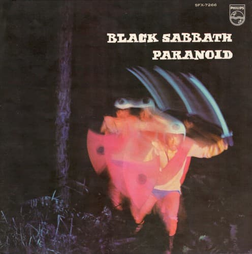
This Birmingham band's third album marked doom metal's visual language taking shape through minimalist brutality rather than fantasy excess.
Visual Language
The fragmented letterforms suggest viewing the title through warped glass or heavy smoke, matching the album's sludge aesthetic perfectly.
Symbols
Warped, fragmented typography
The distorted lettering mirrors the album's detuned guitars and the disorienting weight of songs like 'Into the Void.'
Black void background
The emptiness represents the sonic space Sabbath carved out, rejecting flower-power optimism for Birmingham's industrial darkness.
Purple hue choice
The color bridges occult mysticism with pharmaceutical culture, foreshadowing the album's exploration of drug casualties and cosmic dread.
Where Sound Meets Image
The visual emptiness mirrors the album's downtuned guitars, where Iommi dropped to C# standard tuning, creating the lowest, heaviest sound yet captured on vinyl. The fragmented purple text reflects the disorienting shifts in songs like 'Children of the Grave' and 'Lord of This World,' where riffs collapse into themselves like the distorted letters. The pharmaceutical purple connects directly to 'Sweet Leaf,' the band's marijuana anthem, and the darker drug commentary in 'Hand of Doom,' while the void background matches the cosmic horror of 'Into the Void's' apocalyptic vision.
This cover established that doom metal needed no fantasy illustration—just oppressive color and bold typography to convey crushing heaviness. Every stoner doom and sludge band since, from Sleep to Electric Wizard, learned from this lesson that minimalism can be more oppressive than elaborate artwork. The purple-on-black palette became shorthand for altered consciousness meets occult dread, influencing album designs across decades of heavy music.