Style & Context
Influences
Situationist détournement, culture jamming, punk appropriation art, billboard subversion
Location
Los Angeles serves as both literal location and metaphor for American excess, environmental abuse, and the entertainment industry's spiritual bankruptcy.
Visual Language
The cover employs guerrilla semiotics, hijacking recognizable visual language to inject counter-cultural messaging into familiar symbols of power.
Symbols
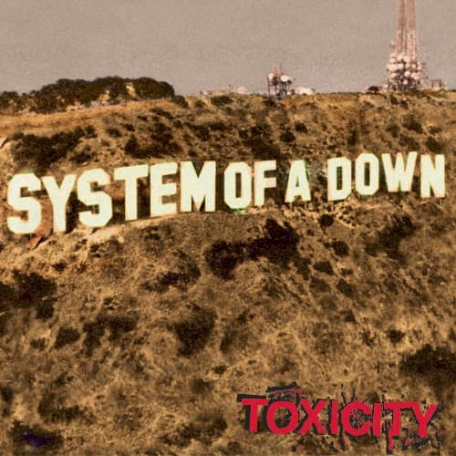
Hollywood sign parody
The appropriation mocks American entertainment culture while the band claims territorial dominance over the very landscape that manufactures false consciousness.
Transmission towers
These industrial structures loom as skeletal reminders of the media apparatus broadcasting the toxicity the album diagnoses.
Barren hillside
The stripped vegetation mirrors environmental and cultural degradation, reflecting the album's themes of ecological collapse and societal poison.
Where Sound Meets Image
The stark visual simplicity mirrors the album's directional clarity despite its musical complexity. Just as the cover strips away Hollywood glamour to reveal scorched earth, tracks like 'Chop Suey!' and 'Aerials' tear through radio-friendly packaging to expose raw questions about suicide, drug culture, and spiritual emptiness. The monumental scale of the typography reflects the band's maximalist approach—cramming progressive time signatures and Armenian melodic modes into three-minute bursts. The red 'Toxicity' title visually echoes the album's lyrical focus on poison in water, air, cities, and minds.
This cover established a template for political metal artwork that prioritizes conceptual clarity over fantasy illustration. Its influence appears in later bands who use photographic irony rather than painted dystopias to critique society. The design proved that nu-metal could engage with visual art traditions beyond tribal graphics and flame effects, helping legitimize the genre's intellectual ambitions.