Style & Context
Influences
Robert Mapplethorpe, gothic horror cinema, fetish photography, 1920s German Expressionism
Location
The cover emerged from Brooklyn's gothic metal scene, where Type O Negative fused doom metal heaviness with gothic rock's romantic melancholy.
Visual Language
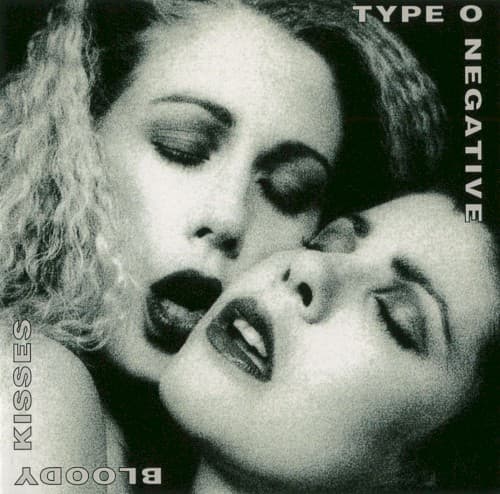
The photographer employed dramatic lighting to create deep shadows that frame the subjects' faces while their pale skin nearly glows against the darkness.
Symbols
Inverted typography
The upside-down band name at bottom forces viewers to physically turn the album, mirroring the band's inversion of metal conventions.
Dark lipstick
The women's black lipstick references both goth subculture aesthetics and the album's title through visual suggestion of blood.
Closed eyes
Both subjects have their eyes shut, creating vulnerability and suggesting a private moment being witnessed without their awareness.
Where Sound Meets Image
The cover's intimate yet morbid imagery mirrors the album's lyrical obsessions with love, death, and the space where they intersect. Songs like 'Black No. 1' and 'Christian Woman' explore similar themes of forbidden desire and gothic romance that the cover visualizes. The stark monochrome matches the album's doom-laden pace and Peter Steele's deep baritone vocals, while the theatrical presentation reflects the band's self-aware humor about gothic clichés. The sensuality combined with darkness captures the album's ability to be simultaneously romantic and menacing.
This cover helped establish gothic metal's visual language, proving the genre could embrace sophisticated eroticism rather than crude objectification. Its success influenced countless bands to adopt more artistic, photography-based covers that explored themes of desire and death. The image remains one of metal's most recognized covers from the 1990s, frequently censored yet endlessly reproduced, demonstrating how visual provocation could amplify an album's cultural impact.