Style & Context
Influences
Hieronymus Bosch, medieval woodcuts, horror comics, H.R. Giger
Location
This marked Slayer's deliberate shift from speed to atmosphere, requiring visuals that emphasized dread over velocity.
Visual Language
The technique layers realistic bone texture with surreal architectural elements, creating depth that rewards close examination.
Symbols
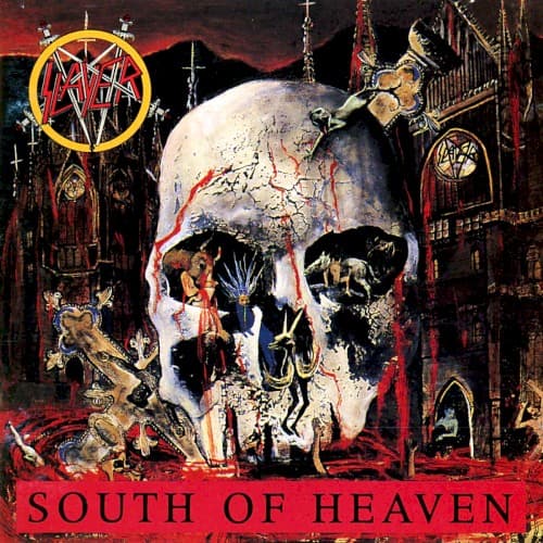
Cracked skull cathedral
The human head becomes a literal hell where sinners dwell eternally in architectural torment.
Inverted pentagram (upper left)
Slayer's trademark Satanic imagery marks this as explicitly anti-religious territory from the opening frame.
Gothic church spires
Christianity's monuments are corrupted into instruments of suffering rather than salvation or hope.
Where Sound Meets Image
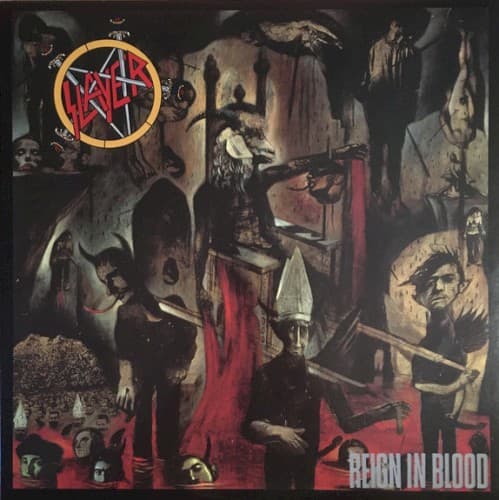
The skull's cracked, weathered surface mirrors the album's departure from Reign in Blood's relentless assault toward mid-tempo, crushing heaviness. The miniature suffering figures reflect lyrics exploring damnation from multiple perspectives—the torturer, the victim, the observer. The Gothic architecture connects directly to the title track's medieval atmosphere and Tom Araya's unusually melodic vocal approach. Where earlier Slayer covers showed external violence, this one depicts eternal, internal suffering—matching the album's more psychological horror themes.
This cover established that extreme metal artwork could be compositionally complex rather than simply shocking, influencing death metal bands to create densely detailed covers in the 1990s. The skull-as-architecture concept has been endlessly referenced in metal art, from Grave to modern bands. It proved thrash could embrace slower tempos visually and sonically, paving the way for doom-thrash hybrids and showing that Satanic imagery could be artistically ambitious rather than cartoonish.