Style & Context
Influences
Hieronymus Bosch, Giger's biomechanics, EC Comics horror, surrealist collage techniques
Location
This cover pushed boundaries even hardcore punk had respected, visualizing lyrics about Nazi atrocities and genocide.
Visual Language
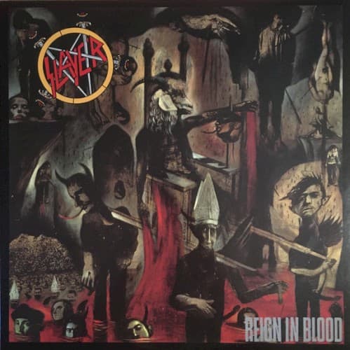
The layered collage technique creates spatial confusion that mirrors the album's disorienting speed and aggression.
Symbols
Central red-draped throne
The blood-soaked seat represents tyrannical power built on violence and human suffering.
Skeletal and demonic faces
Multiple death masks symbolize the album's body count and obsession with mortality's many forms.
Fragmented architectural spaces
Disjointed chambers mirror the album's schizophrenic tempo shifts and structural violence.
Where Sound Meets Image
The chaotic composition directly mirrors the album's structural violence and breakneck tempos. Multiple torture scenes visualize specific lyrical content from tracks about Josef Mengele and wartime atrocities. The suffocating spatial arrangement reflects how the album offers no respite between songs, creating unrelenting sonic claustrophobia. The blood-red accents punctuate the composition like Kerry King's razor-wire solos puncture the rhythm section's assault.
This cover established that extreme metal artwork could match lyrical content without metaphor or abstraction. Its collage approach influenced countless death metal covers throughout the nineties, particularly the stacked-composition style. The willingness to depict actual horror rather than fantasy monsters gave extreme metal visual legitimacy as confrontational art rather than adolescent shock tactics.