Style & Context
Influences
modern design minimalism, scientific microscopy, experimental album aesthetics
Location
Rise Records' roster push toward genre fusion finds visual expression in this departure from scene conventions.
Visual Language
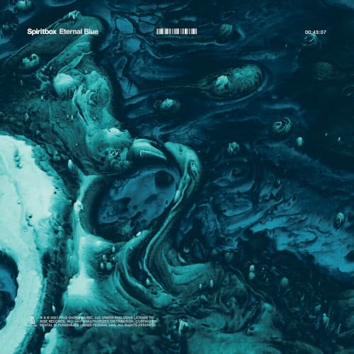
The cover employs contemporary digital art techniques that distance it from metal's illustrative traditions entirely.
Symbols
Liquid marble texture
The flowing, unstable patterns represent the dissolution of rigid genre boundaries and mental states.
Barcode placement
The stark digital identifier contrasts organic chaos, highlighting technology's role in modern metal's evolution.
Submerged perspective
The underwater viewpoint suggests psychological submersion and the crushing weight of emotional turmoil.
Where Sound Meets Image
The swirling fluidity directly reflects Courtney LaPlante's vocal dynamics, which shift from clean ethereal passages to crushing screams within single songs. The underwater atmosphere connects to lyrical themes of drowning in anxiety and depression explored throughout tracks like 'Circle With Me' and 'Hurt You.' The abstract approach mirrors the band's djent-influenced production, where rhythm and texture supersede traditional verse-chorus structures, creating soundscapes as shapeless and enveloping as the cover's liquid forms.
This cover helped cement the visual language of modern progressive metalcore's departure from illustrative brutality toward minimalist abstraction. The design influenced a wave of 2020s metal releases that favor monochromatic digital art over traditional fantasy or horror imagery, signaling maturity and crossover ambition. Its success demonstrated that metal albums could compete aesthetically in streaming-era thumbnail culture without sacrificing genre identity.