Style & Context
Influences
Constructivism, anti-war propaganda posters, Fudge Tunnel's industrial aesthetics, punk zine collage
Location
The cover speaks to Brazil's military dictatorship legacy that ended just eight years prior in 1985.
Visual Language
The deliberate visual chaos uses overlapping imagery to overwhelm the eye, mirroring the album's dense, punishing sound.
Symbols
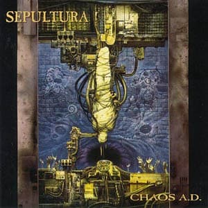
Inverted hanging figure
The upside-down golden body represents political prisoners and torture victims in military dictatorships.
Mechanical gears and tanks
War machinery literally crushes humanity, illustrating how state violence treats people as disposable components.
Layered photomontage technique
Multiple transparent images create visual chaos that mirrors the album's rejection of linear thrash structures.
Where Sound Meets Image
The fragmented, layered composition mirrors the album's groove-based brutality and tribal percussion experiments. Where earlier Sepultura covers featured occult imagery, this stark political statement matches lyrics addressing police brutality, environmental destruction, and authoritarian violence. The inverted figure's tortured positioning reflects the album's slower, heavier tempos—this isn't speed-driven thrash but deliberate, crushing weight. The industrial textures visualize the mechanical precision of songs like 'Refuse/Resist' and 'Territory,' where groove replaces velocity as the primary weapon.
This cover established that thrash metal could address contemporary political violence without fantasy metaphors. Its photomontage technique influenced countless late-90s extreme metal bands seeking rawer, more confrontational visual identities. The design proved Brazilian metal belonged in global conversations, not as exotic outsiders but as vital commentators on universal oppression. Its deliberate ugliness rejected the fantasy escapism dominating metal artwork, opening space for bands like Napalm Death and Neurosis to embrace similarly challenging visuals.