Style & Context
Influences
Medieval woodcuts, anti-religious propaganda, Norwegian romanticism
Location
Trondheim's Nidaros Cathedral served as coronation site for Norwegian kings since the Middle Ages.
Visual Language
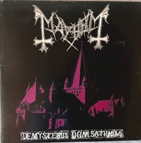
The silhouette technique reduces architectural detail to pure symbolic form, stripping the cathedral of its intended majesty.
Symbols
Nidaros Cathedral silhouette
Norway's most sacred Christian site becomes a monument to spiritual rebellion and anti-religious defiance.
Inverted color scheme
Magenta replaces traditional stone gray, corrupting the cathedral into something profane and otherworldly.
Corpse-paint logo design
The jagged lettering mimics both medieval blackletter and weaponry, declaring war on organized religion.
Where Sound Meets Image
The cover's minimalist brutality mirrors the album's raw production and nihilistic lyrics about death and anti-cosmic philosophy. Just as the music strips metal down to primal aggression, the visual reduces a complex cathedral to a simple blasphemous statement. The magenta glow suggests something unnatural has possessed the holy site, matching the album's themes of spiritual corruption. The overwhelming blackness reflects the suffocating atmosphere of songs like 'Freezing Moon' and 'Funeral Fog,' where darkness consumes everything.
This cover established the template for Norwegian black metal aesthetics: minimal color, maximum blasphemy, and local cultural symbols inverted. Countless bands copied the silhouette-against-black approach, though few achieved this level of focused menace. The design proved that effective extreme metal art required no gore or fantasy creatures—just one stark image that violated the viewer's cultural sanctity. Its influence extends beyond music to fashion, tattoo culture, and contemporary dark art that weaponizes familiar symbols.