Style & Context
Influences
Dan Dare sci-fi comics, EC Comics horror, Robert Williams lowbrow surrealism
Location
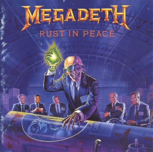
The cover speaks directly to thrash metal's politically engaged wing, refusing apathy about global annihilation.
Visual Language
Repka's hyperrealistic airbrush technique renders the absurd scenario with documentary seriousness, amplifying the satire's bite.
Symbols
Vic Rattlehead with raised bomb
The mascot's triumphant gesture mocks political leaders celebrating weapons that guarantee mutual destruction.
Business suits on council members
Corporate conformity disguises the death dealers, suggesting complicity between government and military-industrial interests.
Warheads replacing briefcases
Bureaucratic instruments of policy become literal instruments of annihilation in this satirical inversion.
Where Sound Meets Image
The cover's mechanical precision mirrors Dave Mustaine and Marty Friedman's intricate guitar architectures on tracks exploring military technology gone haywire. Holy Wars addresses religious conflict fueling endless combat, while Hangar 18 delves into government conspiracy theories, both themes the cover visualizes through its sinister boardroom tableau. The explosive yellow energy coursing through the image matches the album's relentless tempos and technical pyrotechnics, suggesting controlled chaos about to detonate.
Repka's Rust in Peace artwork established the template for politically satirical metal covers that blend comic exaggeration with serious commentary. The image became so synonymous with technical thrash that countless bands borrowed its visual vocabulary of suited authority figures and nuclear imagery. Vic Rattlehead's most recognizable incarnation appears here, cementing the mascot's place alongside Iron Maiden's Eddie as metal's most enduring character-based branding.