Style & Context
Influences
H.R. Giger biomechanics, Frank Frazetta power dynamics, 1970s van art
Location
The cover bridged British metal's working-class grit with American arena rock's commercial ambition and visual bombast.
Visual Language
Doug Johnson's airbrush work achieves the impossible balance between Saturday morning cartoon accessibility and genuine menace.
Symbols
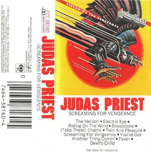
Mechanized eagle
The bird fuses natural predatory power with industrial armor, embodying metal's union of raw aggression and technical precision.
Descending attack posture
The downward trajectory with extended talons visualizes the album title's promise of violent retribution and uncompromising force.
Red sun backdrop
The rising or setting sun suggests both apocalyptic endings and new beginnings for metal's commercial breakthrough.
Where Sound Meets Image
The cover perfectly captures the album's sonic evolution toward streamlined, radio-ready heavy metal without sacrificing intensity. The mechanized eagle mirrors Rob Halford's piercing screams cutting through Glenn Tipton and K.K. Downing's precision riffing on tracks like 'Electric Eye' and the title track. The yellow background reflects the album's cleaner production and more accessible songwriting, while the talons visualize the lyrical themes of technological surveillance, rebellion, and unleashed fury that run through the record.
This cover established the template for 1980s metal's visual language, proving aggressive imagery could coexist with commercial success. The mechanized eagle influenced countless imitators and became Priest's lasting symbol, appearing in various forms across their career. The design's marriage of sci-fi aesthetics and predatory violence can be traced directly to later power metal and speed metal album art, cementing the idea that metal bands needed singular, merchandisable symbols.