Style & Context
Influences
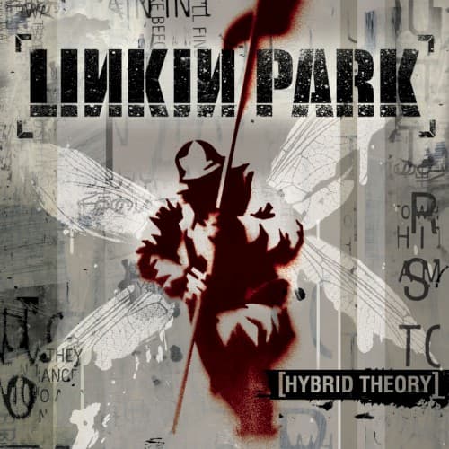
Banksy street art, Shepard Fairey's Obey campaign, Mike Shinoda's graphic design background, punk zine aesthetics
Location
The cover speaks to mall parking lots and bedroom studios where kids created their own war zones against emotional numbness.
Visual Language
The stencil-graffiti approach democratizes military symbolism, transforming state violence into personal expression through underground art techniques.
Symbols
Winged soldier silhouette
The figure represents the listener trapped between spiritual aspirations and earthly combat, wings clipped by reality.
Blood-red stencil technique
The spray-paint aesthetic connects military imagery to street rebellion, making warfare personal and localized.
Layered sheet music
Musical notation buried beneath graffiti shows melody suffocating under noise, the theory crushed by practice.
Where Sound Meets Image
The layered, collaged aesthetic directly mirrors the album's production technique of stacking Chester Bennington's screams over Mike Shinoda's rapped verses with DJ scratches and electronic samples. The blood-red soldier embodies 'One Step Closer's' explosive rage, while the ghostly wings reference 'My December's' haunting vulnerability. The fragmentary text and torn surfaces visualize the album's central theme of fractured identity explored in 'Papercut' and 'Crawling,' where internal voices wage war against each other. The sheet music bleeding through grunge captures the tension between the band's studied musicianship and their deliberate embrace of raw, unpolished emotion.
This cover established stenciled military imagery as nu metal's visual shorthand, spawning countless imitators in both album art and merchandise design. The red-and-gray color scheme became so synonymous with the genre that it persisted long after nu metal's commercial peak. Mike Shinoda's graphic design background ensured the cover functioned equally well as a logo, CD spine, and t-shirt print, pioneering the album-as-brand approach that would dominate 2000s rock marketing.