Style & Context
Influences
Soviet constructivist posters, punk DIY aesthetics, British industrial design
Location
This Birmingham band transformed their city's steel manufacturing identity into a global metal aesthetic vocabulary.
Visual Language
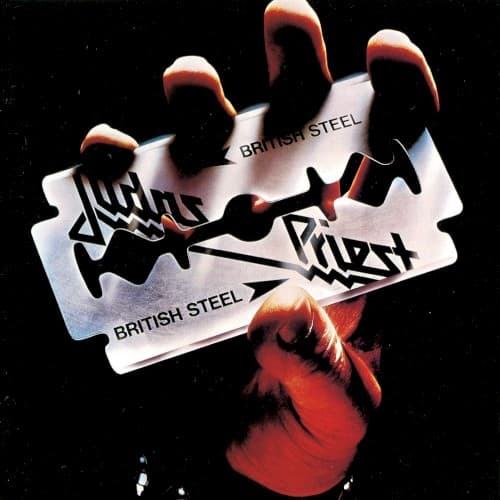
The razor-sharp focus and dramatic rim lighting create an advertisement-quality image that elevated metal's visual sophistication beyond hand-drawn fantasy art.
Symbols
Razor blade
The blade represents both the cutting edge of the NWOBHM sound and the danger of British working-class anger.
Red leather glove
The crimson fist symbolizes labor power and the bloodied hands of factory workers reclaiming metal from America.
Chrome finish
The reflective steel surface embodies the cold industrial landscape of Birmingham's metalworking heritage and mechanical precision.
Where Sound Meets Image
The stark simplicity mirrors the album's streamlined approach after the experimental Killing Machine. Breaking the Law and Living After Midnight's anthemic structures match the cover's bold clarity. The chrome blade's edge reflects the guitar tone's surgical precision, while the red glove's warmth represents Rob Halford's soaring vocals cutting through the mechanical riffs. Even the blade's repeated British Steel stamp mirrors the album's memorable, chant-worthy hooks designed for arena singalongs.
This cover established chrome and leather as metal's visual language, inspiring countless imitators but never being equaled. The image proved metal artwork could be sophisticated product photography rather than fantasy illustration, opening doors for bands to work with commercial photographers. Its simplicity made it perfect for t-shirts, patches, and tattoos, becoming one of the most replicated images in metal history. The razor blade fist remains instantly identifiable across generations, transcending the album itself to represent heavy metal's industrial soul.