Style & Context
Influences
Frank Frazetta, Boris Vallejo, Rodney Matthews, Heavy Metal magazine
Location
The cover arrived when NWOBHM bands were embracing fantasy themes over punk's street-level realism.
Visual Language
The airbrush technique creates the soft gradients and glowing effects typical of early-1980s fantasy art commercialization.
Symbols
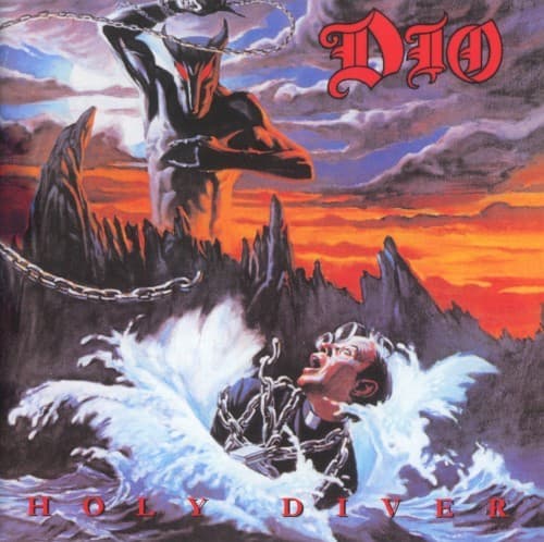
Chained priest drowning
The cover depicts organized religion's submission to primal forces, reflecting metal's ongoing conflict with Christian morality.
Horned demon wielding chains
The devil figure represents personal liberation through darkness, a central theme in Dio's post-Sabbath lyrical universe.
Second demon on cliff
The overseer position suggests hierarchy even in hell, mirroring the power structures metal claims to reject.
Where Sound Meets Image
The cover's literal interpretation of the title track mirrors Dio's direct lyrical approach—no abstract poeticism, just vivid storytelling. The demon's chains reference the album's recurring imprisonment metaphors across tracks like Don't Talk to Strangers and Invisible. The apocalyptic sky gradient matches the music's blend of doom-laden verses and soaring, triumphant choruses. The fantasy setting visually establishes the album's lyrical universe where mystical battles substitute for real-world struggles, a Dio trademark that separated his solo work from Black Sabbath's industrial bleakness.
The cover codified fantasy metal aesthetics for the 1980s, proving that direct visual storytelling could match conceptual ambiguity. Countless power metal bands adopted similar airbrush techniques and literal title interpretations throughout the decade. The image became so synonymous with Dio that tribute bands and metal bars worldwide use variations as shorthand for classic heavy metal values. Modern bands like Visigoth and Eternal Champion continue its sword-and-sorcery lineage, while the cover's unapologetic religious imagery remains a benchmark for metal's willingness to provoke mainstream sensibilities.