Style & Context
Influences
B-movie posters, accidental photography, anti-commercial aesthetics, punk DIY ethos before punk existed
Location
Birmingham's industrial grime and economic desperation manifests in the cover's refusal of polished prog-rock fantasy aesthetics.
Visual Language
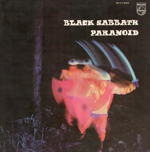
The technical imperfection creates authenticity that no studio composition could achieve for this sound.
Symbols
Motion-blurred sword trails
The streaking weapon captures the album's manic velocity and the paranoid delusion of constant threat.
Pink costume against void
The absurd costume color mocks medieval fantasy while the darkness represents doom's encroaching dread.
Faceless rushing figure
Identity erasure through motion suggests the loss of self under mental breakdown and chemical influence.
Where Sound Meets Image
The motion blur and visual confusion directly translate the album's sonic assault—particularly the title track's speed-freak tempo and Iommi's disorienting tritone riffs. The pink figure's medieval costume connects to 'War Pigs' and 'Iron Man' imagery while simultaneously mocking it through absurdist presentation. The darkness consuming the frame mirrors the doom passages in 'Planet Caravan' and 'Electric Funeral,' where heavy riffs descend into bottomless void. The cover's refusal of conventional beauty matches Ozzy's untrained vocals and the band's determination to sound uglier than contemporary rock.
This cover established that metal album art could succeed through rawness rather than technical polish, influencing countless DIY underground releases. The image's accidental quality gave permission to future bands—particularly in extreme metal subgenres—to prioritize authenticity over production values. Though often cited as one of rock's worst covers, its very awkwardness has become inseparable from the album's identity, proving that visual memorability matters more than conventional aesthetics.