Style & Context
Influences
Minimalist poster design, Japanese aesthetic restraint, independent film credits
Location
The design signaled Deftones' alignment with art rock and post-rock circles rather than Ozzfest mainstage aesthetics.
Visual Language
The clean vector silhouette approach borrowed from indie rock and art film aesthetics rather than metal traditions.
Symbols
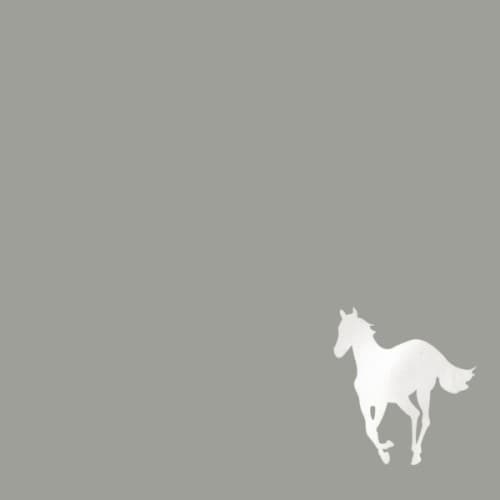
White horse
The pony represents purity corrupted by darkness, matching the album's exploration of addiction and obsession.
Negative space
The vast emptiness surrounding the horse mirrors the psychological isolation explored in tracks like 'Digital Bath.'
Horse's motion
The galloping stance suggests escape or pursuit, embodying the restless energy beneath the album's shoegaze veneer.
Where Sound Meets Image
The sparse visual directly mirrors the album's dynamic contrasts between crushing heaviness and ethereal drift. Just as 'Teenager' explodes from whispered verses into roaring choruses, the white horse emerges from nothingness. The cover's ambiguity matches Chino Moreno's cryptic lyrics about white horses, cocaine dreams, and sexual obsession. The trip hop and shoegaze textures throughout the album find their visual equivalent in this washed-out, dreamlike aesthetic.
This cover helped legitimize minimalism in metal visual culture when the genre was drowning in maximum-everything design philosophy. Its influence appears in later atmospheric metal releases that chose restraint over spectacle. The white pony itself became such a powerful symbol that the album's 20th anniversary reissue leaned heavily into the image's recognition factor.