Style & Context
Influences
H.R. Giger, Salvador Dalí, religious iconography, medical illustration
Location
This cover emerged when death metal bands increasingly explored existential themes rather than gore.
Visual Language
The technique blends photographic realism with painterly decay to create psychological unease and metaphysical uncertainty.
Symbols
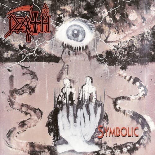
Central omniscient eye
The eye represents inescapable consciousness observing humanity's finite existence and moral choices.
Four ghostly human figures
These figures symbolize humanity stripped bare, vulnerable under the gaze of cosmic judgment.
Coiling serpents
The serpents evoke eternal temptation and the cyclical nature of sin and mortality.
Where Sound Meets Image
The cover's exploration of mortality and perception directly mirrors the album's lyrical content across tracks like 'Crystal Mountain' and 'Empty Words.' Schuldiner was grappling with betrayal, mortality, and human nature throughout these songs, and the vulnerable human figures beneath an unblinking cosmic eye visualize that existential vulnerability. The serpents and decay reflect the album's themes of corruption and inevitable decline. The fractured, dreamlike quality matches the music's progressive structures and Gene Hoglan's intricate drumming, which shattered linear death metal conventions just as the cover fractures conventional reality.
This cover helped establish that death metal artwork could convey philosophical weight without sacrificing visual impact. Its influence appears in countless progressive and technical death metal releases that followed, particularly in the trend toward surrealist imagery over literal gore. The design proved Chuck Schuldiner's artistic vision extended beyond music into complete conceptual statements, setting a standard for cohesive album presentations in extreme metal.