Style & Context
Influences
Crass, Discharge, anarcho-punk zines, agitprop, punk flyer art
Location
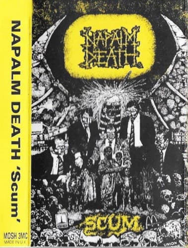
Earache Records operated from a Nottingham bedroom, making lo-fi photocopied art both aesthetic choice and economic necessity.
Visual Language
The intentionally crude photocopier technique rejects professional polish for raw urgency and accessibility.
Symbols
Sickly yellow sun
This diseased orb radiates contamination over the scene, suggesting nuclear fallout or environmental collapse.
Suited figures in gas masks
Political and corporate leaders appear as faceless bureaucrats, indifferent to human suffering below.
Crowd mass beneath
Anonymous humanity crushed under authority, rendered as photocopied blur to emphasize dehumanization.
Where Sound Meets Image
The visual chaos mirrors the album's revolutionary sonic approach—blastbeats, microsongs, and incomprehensible vocals rendered as artistic statement. Just as the band pushed extreme metal to its logical limits with songs under one minute, the cover strips visual presentation to raw essentials. The political imagery reflects lyrical themes of war, corruption, and societal decay across both the Bullen and Broadrick recording sessions that comprise the album. The degraded quality matches the intentionally abrasive production.
This photocopied aesthetic became the visual signature of grindcore and extreme underground metal for years. Countless bands adopted the crude collage approach, establishing that lo-fi production values signaled authenticity rather than amateurism. The cover proved extreme music could reject both metal's swords-and-sorcery clichés and hardcore's band-photo conventions, creating a third visual path that emphasized ideas over imagery.