Style & Context
Influences
Spaghetti Westerns, biker culture photography, punk DIY aesthetics, classic rock band portraiture
Location
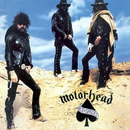
The desert setting reflected heavy metal's expansion beyond urban UK club scenes into broader cultural territory.
Visual Language
The unadorned outdoor photography rejected fantasy art trends, presenting Motörhead as real people in real spaces.
Symbols
Desert Landscape
The barren wasteland represents the band's rejection of commercial rock, claiming hostile territory as their own.
Wide-Brimmed Hats
Two members wearing Western hats position Motörhead as gunslingers in metal's evolution toward thrash.
Ace of Spades Logo
The death card symbol anchors gambling imagery that runs through the title track's lyrics.
Where Sound Meets Image
The exposed, sun-bleached setting mirrors the album's raw production and relentless tempo. Where the title track races at breakneck speed without ornamentation, the cover strips away studio artifice for harsh daylight honesty. The Western outlaw posturing connects to gambling and danger themes in songs like 'Ace of Spades' and 'The Chase Is Better Than the Catch.' The three-against-the-world formation visualizes Lemmy's power trio as a self-sufficient war machine.
This cover established the template for thrash and speed metal aesthetics: real band members as warriors rather than fantasy illustration. The photograph's gritty realism influenced how aggressive metal presented itself visually through the 1980s. The ace of spades symbol became Motörhead's permanent visual identifier, appearing on countless shirts and patches. The desert location shoot concept was recycled endlessly by metal bands seeking authenticity over artifice.