Style & Context
Influences
Scientific diagrams, Romantic era nature prints, NASA photography, conservation posters
Location
Progressive death metal bands were abandoning gore imagery for conceptual environmentalism and philosophical depth during this period.
Visual Language
The cover merges naturalist illustration traditions with astronomical imaging to create speculative environmental science fiction.
Symbols
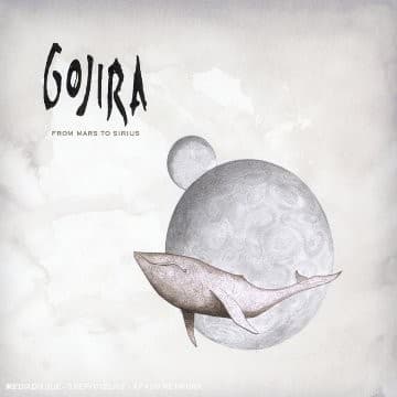
Whale orbiting moon
The marine mammal's impossible trajectory symbolizes ecological systems thrown catastrophically out of balance by human interference.
Monochromatic rendering
The absence of color represents oceanic death and the bleaching of coral reefs documented in marine biology.
Negative space dominance
Vast emptiness mirrors the album's exploration of cosmic insignificance against environmental catastrophe's urgent immediacy.
Where Sound Meets Image
The whale's serene yet unnatural orbit perfectly captures the album's contrast between atmospheric passages and crushing technical riffs. Flying Whales, the record's centerpiece, literalizes this imagery while tracks like Ocean Planet and Global Warming expand the environmental thesis the cover introduces. The grayscale palette mirrors Mario Duplantier's mechanical precision and Joe Duplantier's processed vocal textures, both clinical yet emotional. The cosmic backdrop reflects the album's conceptual journey from Earth's dying oceans to extraterrestrial escape fantasies.
This cover helped redefine metal artwork as vehicles for political statements rather than pure aesthetic aggression. Its restraint influenced countless progressive and atmospheric metal bands to embrace minimalism and environmental themes. The whale image became Gojira's visual signature, appearing on merchandise and stage backdrops for two decades. The design proved that metal covers could communicate complex ideas through subtlety rather than spectacle, paving the way for bands like Mastodon and Baroness to explore conceptual visual narratives.