Style & Context
Influences
EC Comics horror, medical textbooks, splatter films, Hieronymus Bosch
Location
Florida death metal scene demanded imagery matching the music's brutal technical intensity and transgressive lyrical content.
Visual Language
Locke's technical precision elevates shock value beyond simple gore into carefully composed nightmare tableaux.
Symbols
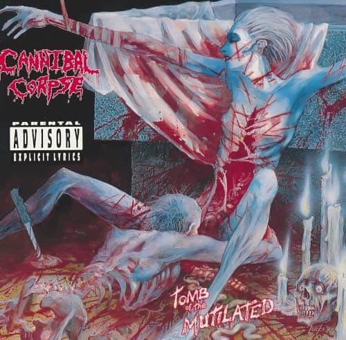
Skeletal remains scattered below
Death metal's obsession with mortality extends beyond flesh to complete bodily dissolution and decay.
Clinical anatomical exposure
The precise rendering of musculature and organs mirrors medical illustration, adding forensic coldness to brutality.
Cannibalistic act depicted
Literalizes the band name while pushing taboo boundaries that define extreme metal's transgressive identity.
Where Sound Meets Image
The cover directly illustrates the album's lyrical fixation on bodily violation, torture, and necrophilia explored across tracks like 'Hammer Smashed Face' and 'I Cum Blood.' Locke's meticulous detail mirrors the band's technical precision and complex song structures, translating brutal riffs and Chris Barnes' guttural vocals into visual form. The clinical coldness of the illustration matches the album's calculated extremity, where violence becomes almost academic in its thoroughness. Just as the music pushes death metal's sonic boundaries, the artwork expands acceptable visual limits for album packaging.
This cover established Vincent Locke as death metal's premier visual provocateur and set the template for extreme album art throughout the 1990s. Multiple countries banned it, making censored versions collectible and proving controversial imagery could drive album sales. The cover influenced countless brutal death metal bands to commission similarly explicit artwork, creating an arms race of graphic content. Decades later, it remains instantly recognizable and continues generating debate about artistic expression versus obscenity, securing its place in metal's visual canon despite—or because of—its notoriety.