Style & Context
Influences
Punk zine aesthetics, early Neubauten imagery, Giger's biomechanical decay
Location
The DIY aesthetic reflects early 2000s hardcore's rejection of polished metal production standards.
Visual Language
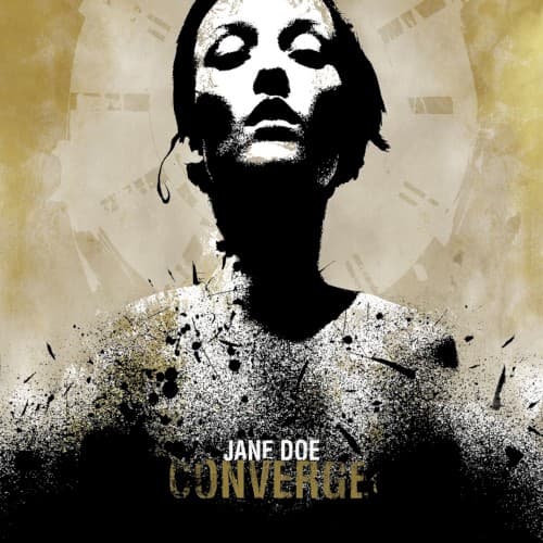
The grainy photocopy quality and aggressive layering mirror DIY hardcore culture's rawness and immediacy.
Symbols
Disintegrating torso
The grain dissolving the figure's body represents identity collapsing under emotional trauma's weight.
Upturned face
The skyward gaze suggests either desperate pleading or acceptance of an inevitable destructive force.
Halo-like circle
The radial pattern behind the head evokes religious iconography twisted into martyrdom through suffering.
Where Sound Meets Image
The visual disintegration mirrors the album's structure, where traditional song forms collapse into Jacob Bannon's shrieked confessions and Kurt Ballou's dissonant guitar chaos. The figure breaking apart into static parallels how the music fragments rhythms and melodies into violent emotional release. The religious imagery connects to lyrics invoking biblical language to describe romantic devastation, while the aged, weathered appearance reflects how obsessive memory distorts and decays the past.
This cover redefined metal and hardcore aesthetics, proving that raw emotional honesty could be more powerful than elaborate fantasy illustration. The design, created by vocalist Jacob Bannon through his Deathwish Inc. imprint, established a template for post-2000 extreme music: high contrast, photographic manipulation, and psychological rather than supernatural horror. Countless metalcore and post-hardcore bands adopted similar fragmented, distressed visual approaches, making the Jane Doe aesthetic nearly as influential as the album's sound.