Style & Context
Influences
horror film makeup effects, Nine Inch Nails aesthetics, psychiatric institution imagery
Location
Released during nu-metal's commercial explosion, this artwork rejected fantasy and skulls for modern psychological terror.
Visual Language
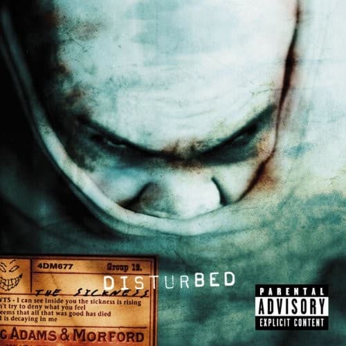
The degraded photographic quality creates an unsettling found-footage feeling, as if documenting something medical or forensic.
Symbols
The Guy's twisted smile
The sinister grin represents the pleasure derived from chaos and the madness lurking beneath civility's surface.
Hollow, shadowed eyes
The empty eye sockets suggest psychological vacancy and the dehumanization central to the album's themes of abuse.
Decaying texture overlay
The corroded, film-grain aesthetic mirrors both mental deterioration and the industrial grit of nu-metal production.
Where Sound Meets Image
The distorted, almost waterlogged appearance of The Guy mirrors the album's down-tuned, effects-heavy production and David Draiman's staccato vocal delivery. The face captures the duality present in tracks like 'Down With the Sickness'—the thin line between victim and aggressor, sanity and madness. The corroded texture echoes the industrial elements in the music, while the color palette matches the album's themes of abuse, institutionalization, and psychological trauma. The confrontational direct stare forces engagement, much like Draiman's signature 'oh-wah-ah-ah-ah' demands listener participation.
The Guy became one of the few mascots born in the nu-metal era to achieve Eddie-level recognition, appearing on every subsequent Disturbed album in evolved forms. This cover established that modern metal imagery could be psychological rather than fantastical, influencing countless bands to explore clinical horror aesthetics over traditional darkness. The success of this simple yet unsettling image proved that in the digital age, a single disturbing face could compete with elaborate painted fantasies.