Style & Context
Influences
Horror comics, occult woodcuts, punk DIY aesthetics
Location
This cover arrived when NWOBHM bands still used fantasy art and commercial polish regularly.
Visual Language
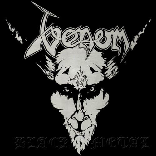
The crude line work and xeroxed quality reflect thrash's garage-born origins and rejection of glossy production.
Symbols
Inverted pentagram forehead
The goat's third eye pentagram inverts traditional religious symbols to signal deliberate blasphemy and occult themes.
Horned goat visage
Baphomet imagery establishes satanic aesthetics as metal's rebellion against Christian conservatism and mainstream acceptance.
Lightning bolt accents
Jagged bolts flanking the logo suggest electrical violence and the raw power surging through the music.
Where Sound Meets Image
The raw simplicity mirrors the album's lo-fi production and chaotic energy. Tracks like 'Countess Bathory' and the title song deal explicitly with occult and satanic themes that the goat imagery represents without subtlety. The aggressive, unpolished visual approach matches Cronos's distorted bass sound and the band's deliberate rejection of technical precision in favor of pure sonic violence and blasphemous attitude.
This cover essentially created black metal's visual language decades before the Norwegian scene formalized it. The goat logo, inverted pentagram, and stark monochrome became templates copied by thousands of extreme metal bands. The design proved that metal album art didn't need elaborate paintings or expensive production — just bold symbols and uncompromising vision.